
Photo by Mika Baumeister on Unsplash
Unleashing the Power of CSS: 10 Mind-blowing Tricks You Never Knew Existed


CSS (Cascading Style Sheets) is a powerful and versatile language used for styling web pages. CSS describes how HTML elements should be presented on the web page. It provides colors, positions to the HTML elements, etc., creates animations, and amplifies your web page.
Developers and web designers are interested in finding new ways to use cool CSS tricks and tips and contribute to enhancing what CSS can do.
Here are ten mind-blowing tricks you can use to create engaging and browser-compatible websites.
Responsive CSS Grids
While taking care of the responsive design, you need to ensure the grid is responsive. Responsive CSS grid is one of the best CSS tricks and tips that offers different ways of creating a customizable grid, irrespective of the device. The most reliable thing is that the CSS grid operates with equal or unequal column sizes.
After making the CSS grid responsive, test it for responsiveness.
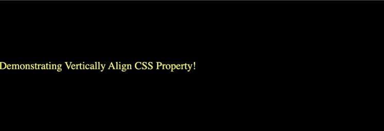
Vertically Align with Flexbox
There are very few CSS tricks available to vertically center elements. It has been a pain point for many developers.
Flexbox is a powerful CSS layout model that makes it easy to align elements both horizontally and vertically within a container. Vertically aligned with CSS Flexbox is one of the best CSS tricks by which developers can effortlessly align with the align-items, align-self, and justify-content properties.
Code:
<div class="align-vertically">
  Demonstrating Vertically Align CSS Property!
</div>

.align-vertically {
  background:black;
  color: #eff542;
  display: flex;
  align-items: center;
  height: 200px;
}
Output:
SVG for Icons and Logos
SVG stands for Scalable Vector Graphics, an XML-based image format for vector graphics on the web. Using SVGs is one of the advanced CSS tricks that offers benefits over PNGs images like higher resolution, faster speed, and better animation quality.
As SVGs are supported by all new browsers and scale across all resolutions, it’s recommended not to incorporate .jpg or .gif images for icons and logos.
Syntax:
.element {
  background-image: url(/images/image.svg);
}
When using SVGs for icons and logos, it's essential to optimize them for the web. Tools like SVGO (SVG Optimizer) can help you reduce unnecessary code and further decrease the file size without compromising quality.
Masking
Let’s say you want to use an image but only want to show certain parts of it. You can achieve this using the mask-image property. CSS masking is among the advanced CSS tricks that allow you to define a mask shape applied to the image. Anything that appears outside the mask shape is cut out, and the rest is presented. It works pretty much the same as masking in Photoshop.
Anything 100% black in the image mask will be displayed entirely, whereas anything 100% transparent will be completely hidden, and anything in-between will be partially masked in the image.
You can perform Masking using two ways:
Using Gradients (Linear and Radial)
Masking with images
Example of Radial Gradient Masking:
#masked{
-webkit-mask-image: radial-gradient(ellipse 20% 90% at 27% 50%, black 40%, transparent 50%);
mask-image: radial-gradient(ellipse 20% 90% at 27% 50%, black 40%, transparent 50%);
}
In the below image, the left side is the original image, and the right side is a masked image with radial-gradient.

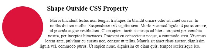
Shape Outside
Shape-outside is a CSS trick that lets you change the shape of the items wrapped around it instead of being restricted to a rectangular box.
The shape-outside property allows shaping the content to fit the image. It takes a basic shape and applies a shape function to the item. This property works only for floated elements.
Syntax:
shape-outside: values;
The shape-outside property can take various values:
none: This is the default value. The element will behave as a regular rectangular box, and the text won't wrap around any specific shape.
<shape-box>: This value defines a basic shape for the float area. The basic shapes include
circle(),ellipse(),inset(), andpolygon().<url>: You can also use an external image or SVG file as the value for
shape-outside.
Example:
Zoom on Hover
Zoom on hover is a CSS trick that makes web pages more attractive. The zoom-on-hover effect can be used in galleries, selling products where you need to enlarge the image to have a better view.
To create a zoom effect on hover in CSS, you can use the transform property along with the transition property. This combination allows you to smoothly animate the scaling of an element when the user hovers over it.
Syntax:
transform: scale [transition-duration] [transition-timing-function] [transition-delay];
Example:
img:hover {
transform: scale(1.1);
 }
Scroll Snapping
CSS Scroll Snap is another CSS trick that allows the developer to create well-controlled scroll experiences.
In normal scrolling, I can stop in the middle of two different sections but it does not happen while I have the scroll-snap activated. It automatically snaps back.
This property can be used in the gallery section of the web page. Page scrolling in CSS is controlled by setting a scroll-snap-type property on a container element. The scroll-snap-type decides scrolling has to be done, i.e., either x or y.
Syntax:
scroll-snap-type: [none | x | y] [mandatory | proximity];
Example:
.y-scrolling { scroll-snap-type: y mandatory; }
Generate Text Animation
CSS Animation is one of the popular advanced CSS tricks and tips that can bring creativity, grab the user’s attention, and convey things quickly while improving usability. The way users read and interact with text elements is changing due to CSS, from hover tweaks to words that float in or scroll on the page.
Creating text animations in CSS can add visual interest and engagement to your web page. One simple way to create a text animation is by using the @keyframes rule along with the animation property.
Some of the most popular text animations are:
Dropping Text.
Typing Text.
Neon Text.
Floating Text.
Rotate Text.
Background Repeat
CSS background is one of the most used advanced CSS tricks; however, very rarely used by developers.
The background-repeat property sets if/how a background image will be repeated. It is used in conjunction with the background-image property. We can repeat the background image along the horizontal axis or vertical axis or not repeat it at all.
By default, a background image is repeated both vertically and horizontally.
Syntax:
background-repeat: value;
The background-repeat property can take the following values:
repeat: This is the default value. The background image will be repeated both horizontally and vertically to fill the entire container.
repeat-x: The background image will be repeated only horizontally, creating a seamless pattern from left to right.
repeat-y: The background image will be repeated only vertically.
no-repeat: The background image will not be repeated at all and will appear only once in the container.
space: The background image is repeated as much as possible without clipping.
round: The background image is repeated and squished or stretched to fill the space (no gaps).
initial: Sets this property to its default value.
inherit: Inherits this property from its parent element.
Example:
 body {
   background-image: url("image.png");
   background-repeat: repeat-x;
 }
Clip-path and Shapes
The clip-path property is a CSS property that allows you to create custom shapes by defining a clipping region for an element. It lets you clip an element to a basic shape or an SVG source.
The clipping region determines which part of the element should be visible and which part should be hidden. This can be used to create unique and non-rectangular shapes for elements on a web page.
The clip-path property can be applied to any HTML element, and it takes various values:
Basic Shapes: You can use basic shapes like
circle(),ellipse(),inset(),polygon(), etc., to define the clipping region.Custom Shapes: You can create your custom shapes by specifying the coordinates of the points using the
polygon()function.URLs and SVGs: You can also use external resources like images or SVGs as the value for
clip-path. This allows for more complex and detailed shapes to be used as clipping regions.Example:
  .element {
    clip-path: polygon(0 0, 100% 0, 100% 80%, 0% 100%);
  }
However, it's important to note that the
clip-pathproperty may not be supported in all browsers, especially older ones.
It’s awesome to play around with CSS and learn new advanced tricks.Hope these cool CSS tricks and tips will certainly help you create mind-blowing websites.
Remember that some of these tricks might require vendor-specific prefixes or have limited support in older browsers, so it's essential to test and ensure compatibility across different platforms. But CSS continues to evolve, and newer versions bring even more possibilities for creative and mindblowing effects.